
By the time we finish high school, we realise that a lot of the time the things they taught us weren’t that useful or interesting. Sure, you might be able to name the European countries or point out major landmarks on a map, but does that give you a real understanding of how the world functions? To fill this gap, we have gathered a great and informative selection of infographical maps that they should have shown us at school: every single one of these maps reveals different fun and interesting facts, which can actually help you draw some pretty interesting conclusions.
What makes infographical maps so engaging is how easy it becomes to conceive graphically presented information. There are brilliant services like Target Map that “allow everyone (from individuals to large organizations) to represent their data on maps of any country in the world and to share their knowledge with the whole Internet Community.” Just choose a country and a way to create your map by color, type values or by uploading your excel files (you can even use your zip / postal code column to get the best and most accurate maps).
Without further ado, we invite you to learn things like most popular sports in different countries, who has the largest breasts, the “frequency of red hair” map of Europe (our personal favourite!!!), world’s most consumed alcoholic beverages, or which brands dominate in different states of the USA.
Trust us, these are way better than the ones they taught you at school!
And if the below tickles your fancy, you’ll love the map-related art currently for sale on artFido HERE!
The Most Famous Brand From Each State In The US:


Red Hair Map of Europe:


Most Popular Sports in the World:


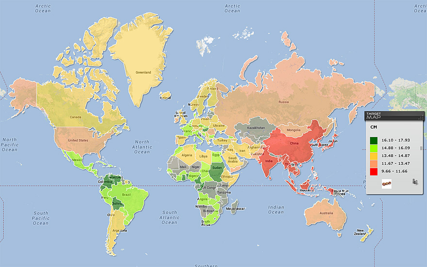
Breast Sizes Relating to Countries:


Political World Map as Pangea 200-300 Million Years Ago:


The World According to Americans:


Most Used Web Browser World Map (2012):


Map of Countries Officially Not Using the Metric System:


The Penis Size Worldwide:

Map of the Most Common Surnames in Europe:


Map of Countries Most and Least Welcoming to Foreigners:


World Map of National IQ Scores:


Beer Names in Different European Languages:

Freedom of Press:

Most Consumed Alcoholic Beverage by Country:

A World Map that Inverts Land and Sea:


Worldwide Driving Orientation:

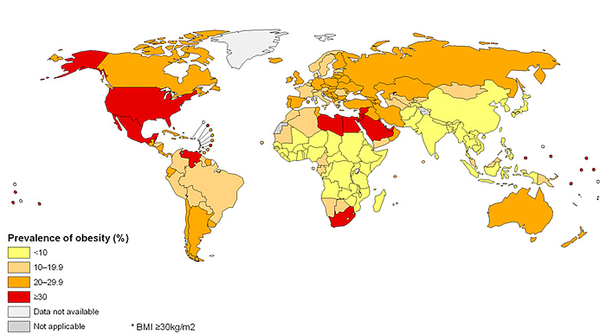
Prevalence of Obesity:
Map Of Most Attractive Citizens in Europe:

European Citizens Who Drink the Most:

United States According to Auto-complete:

Every Country England Has Ever Invaded (all but 22 countries in the world):

7 Deadly Sins Map:

World Map of Social Networks 2009 vs 2012:

Total Fertility Rate Map:

Map of the World in Proportion to Population:

Different Alphabets Around the World:

World’s Population Concentrated in One City:

Countries with McDonald’s:
Map of the Most Popular Surnames in the United States:

Lightning Intensity Map:

Map of the Earth With Mercator Projection Using a Different Centerpoint:

Time Zones in Antarctica:


If US Cities Had Kept Their Original Names:


0 Comments